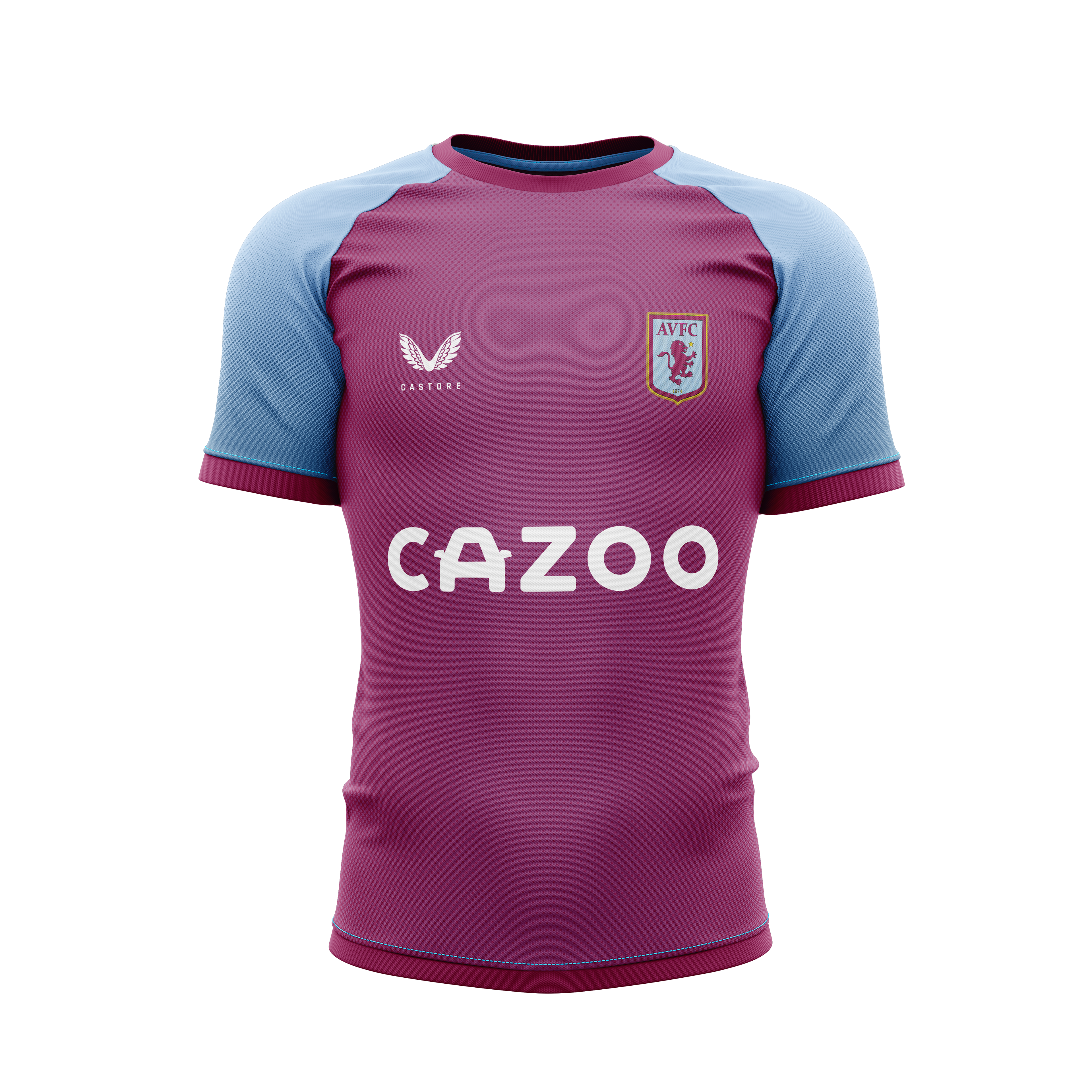
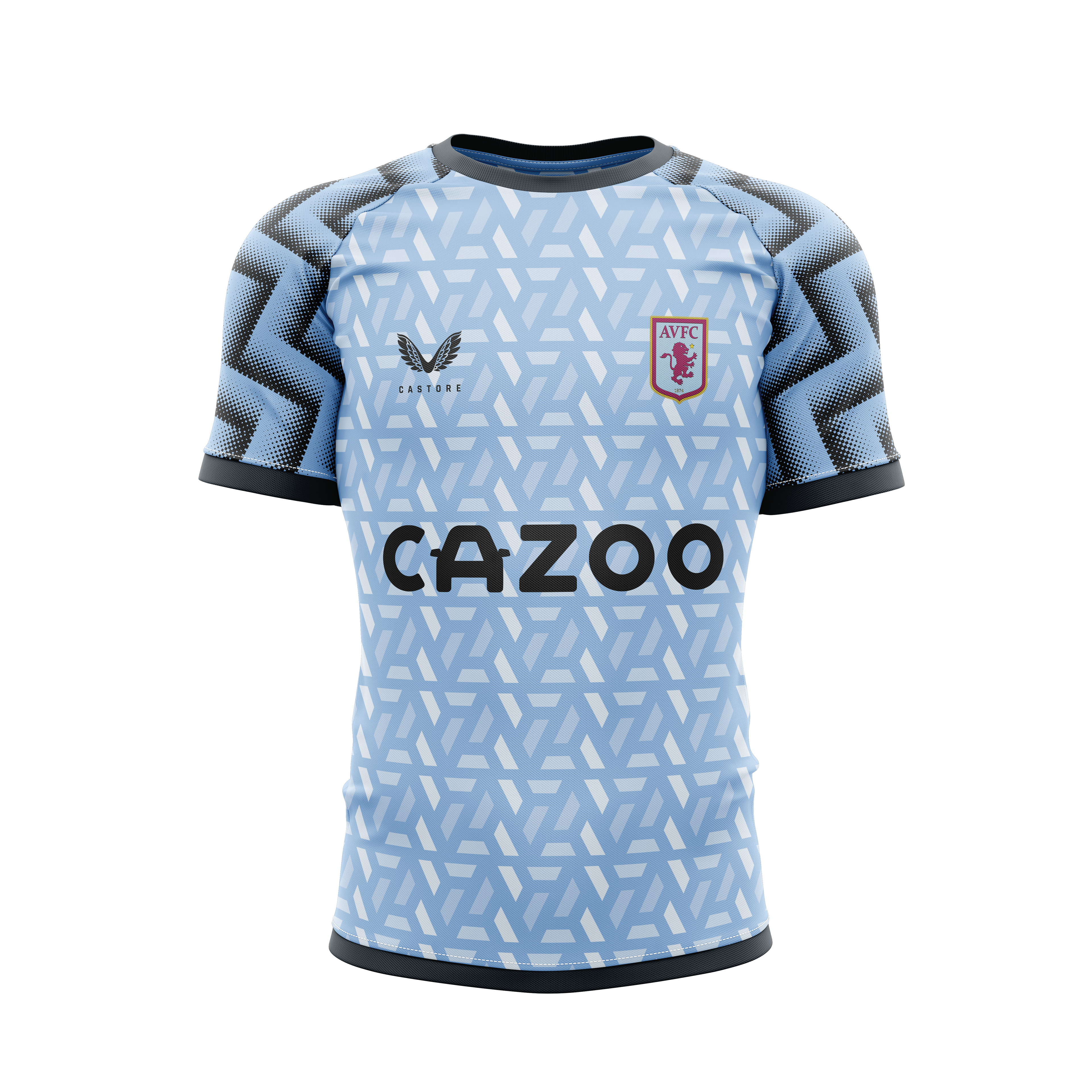
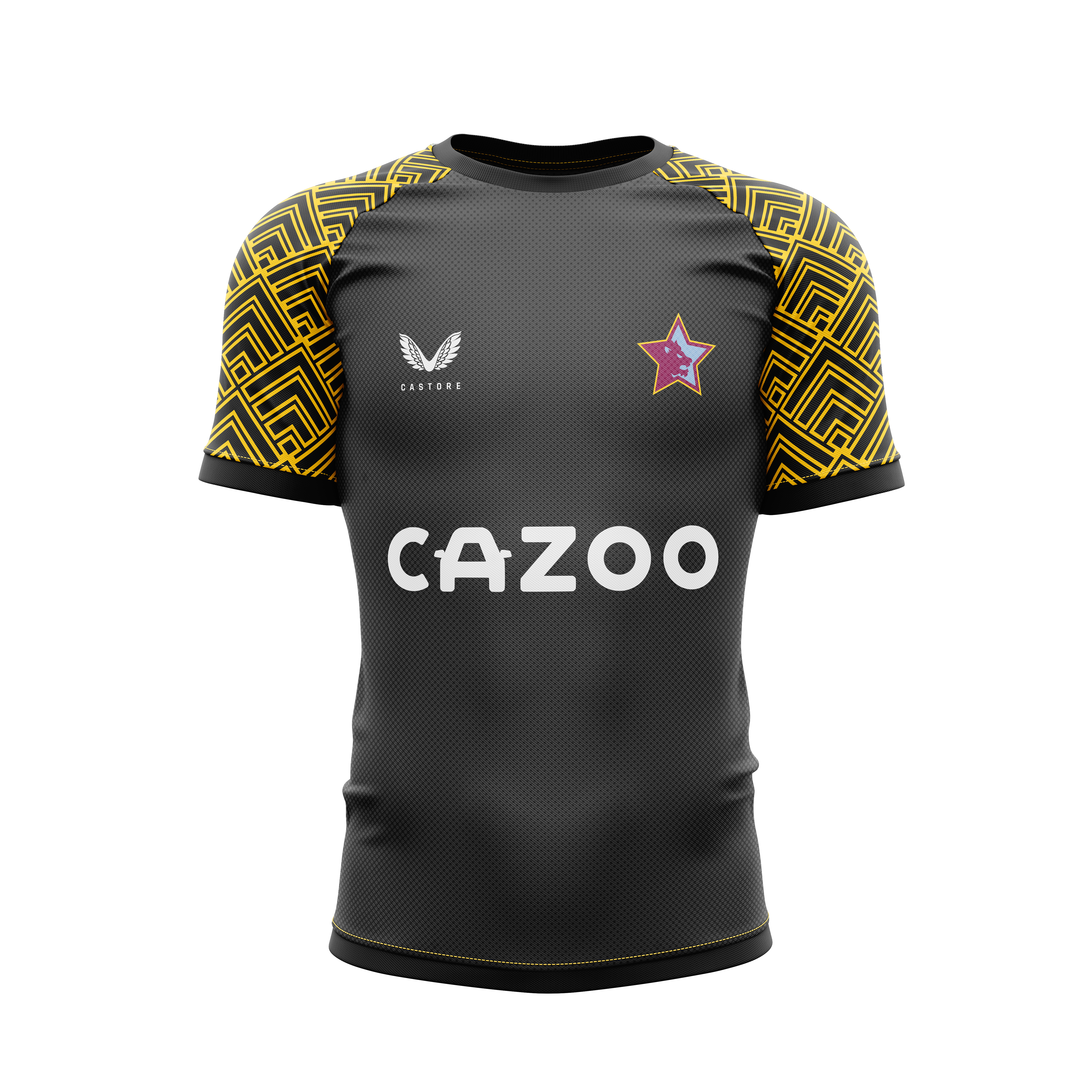
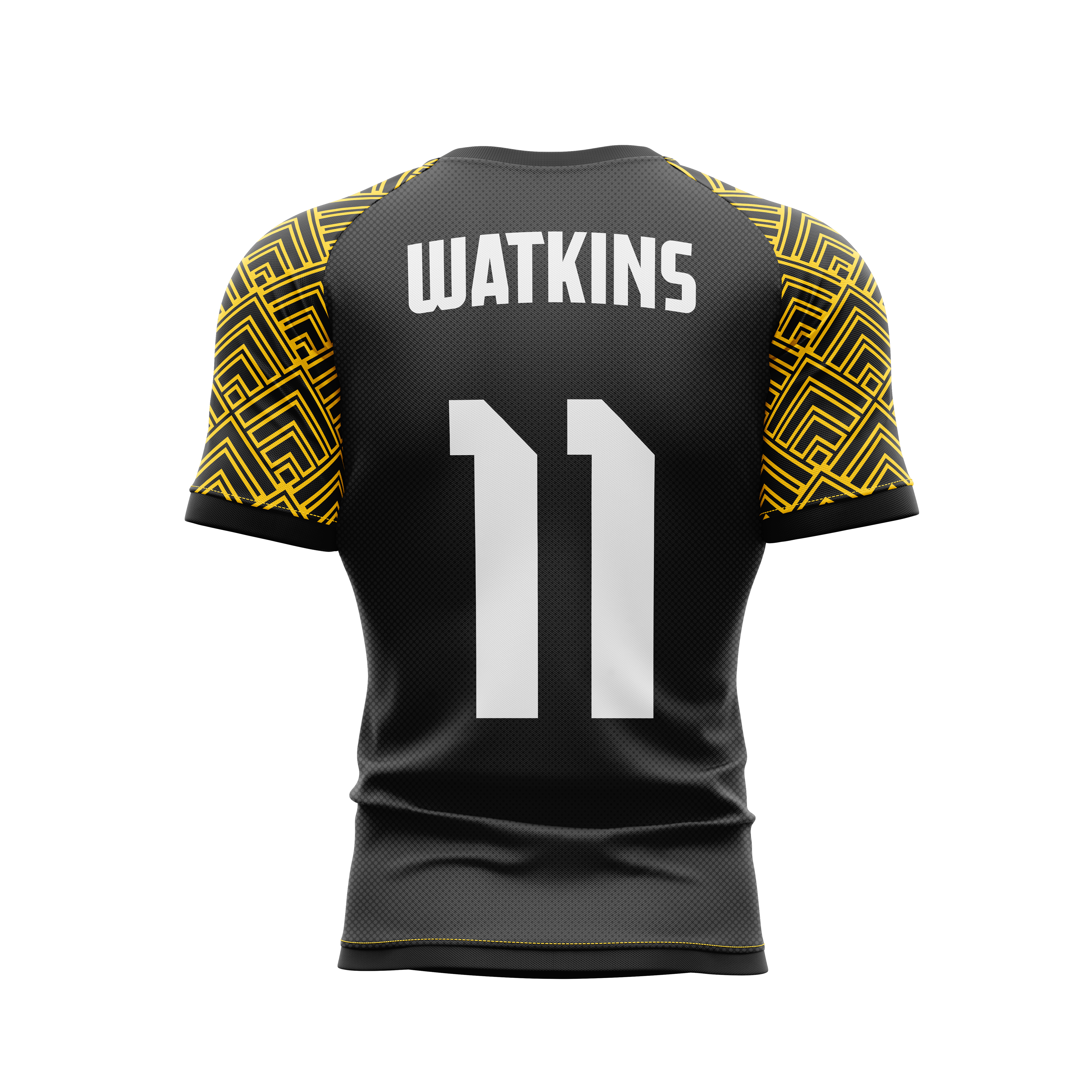
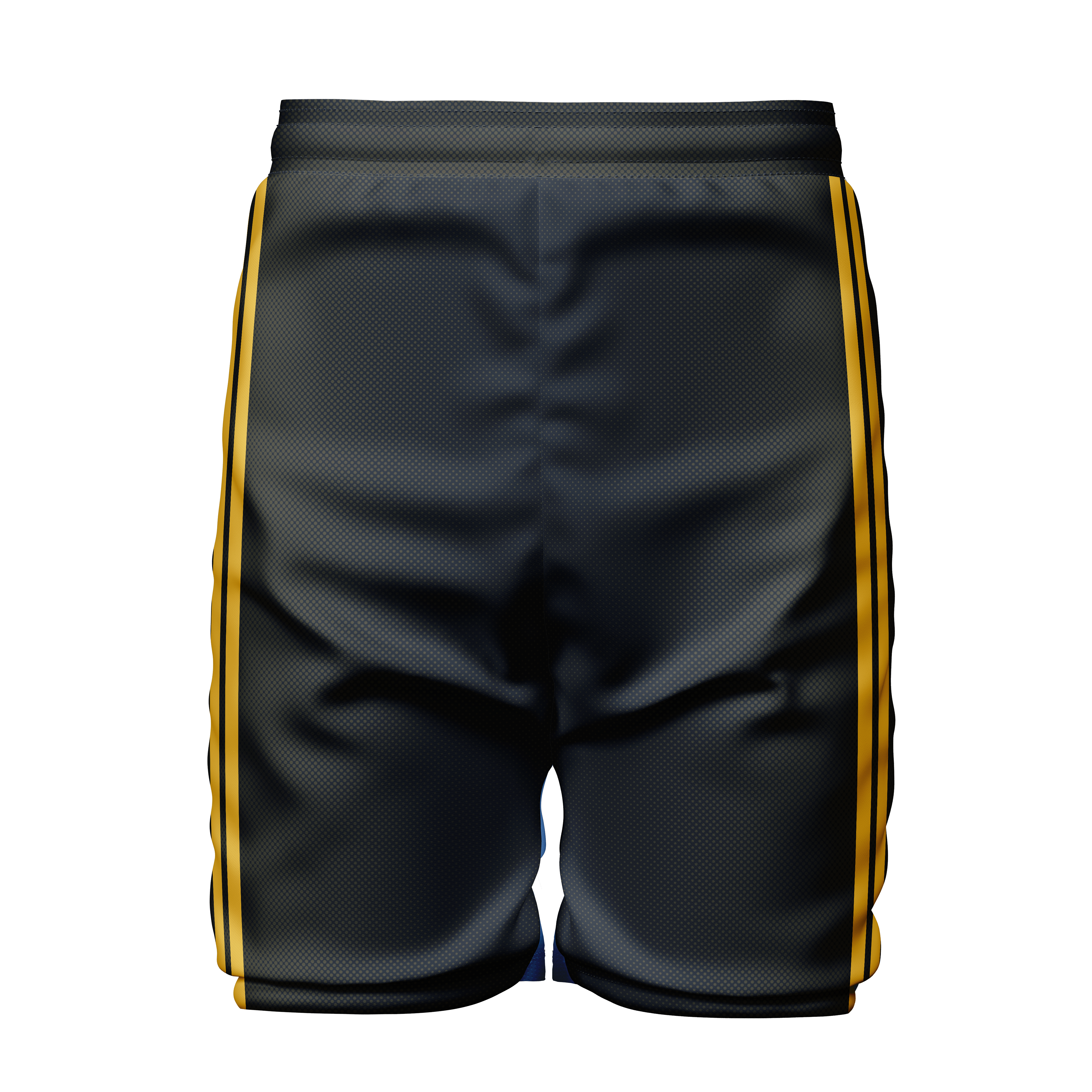
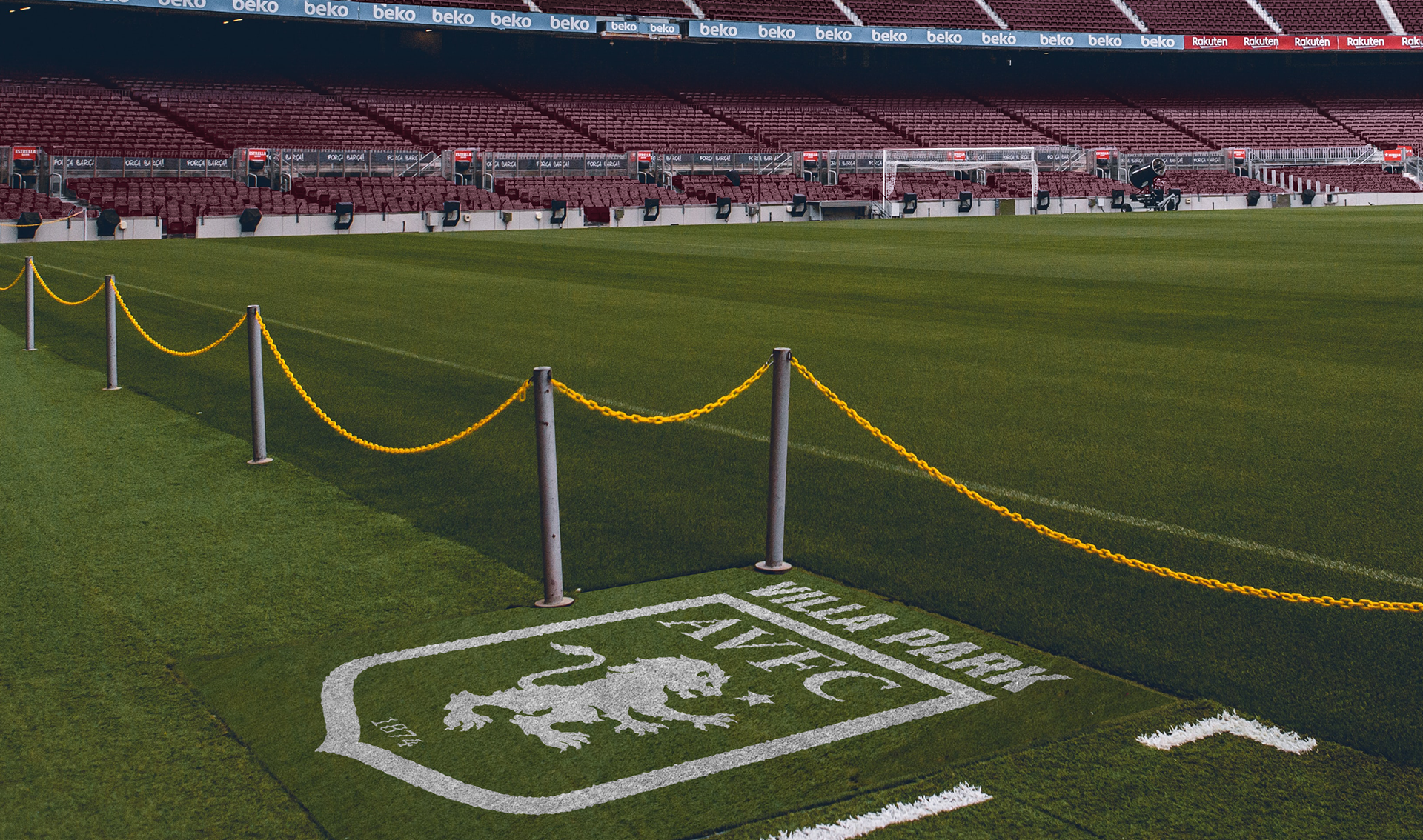
Aston Villa is a Football club based in Birmingham, UK. They are a club with a very rich history, and they recently celebrated their 150th anniversary. By refining the visual representation of the club, I aim to honor their history while embracing the future.
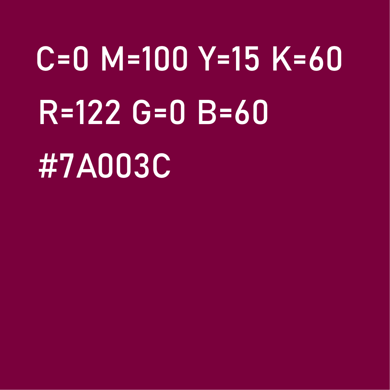
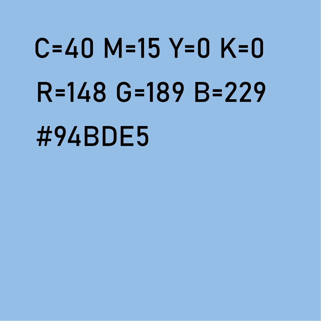
Aston Villa has gone through many logo changes in the past. Recently however they tried to update their logo again, they did this by opening up a vote to every club member, giving them two options to choose from. What they chose was the logo they have now been using since 2023. This new change however hasn't proven beneficial to the club as they have now almost scrapped the new logo, only using it as the crest on their jerseys, while going back to the old logo for all their social media, websites, and promotional material. A new logo has surfaced showing that the club intends to go back to a modern version of their Shield logo, however, fans online have shown dissatisfaction with the leaked design saying that it looks cheap and they don't want it as their crest.
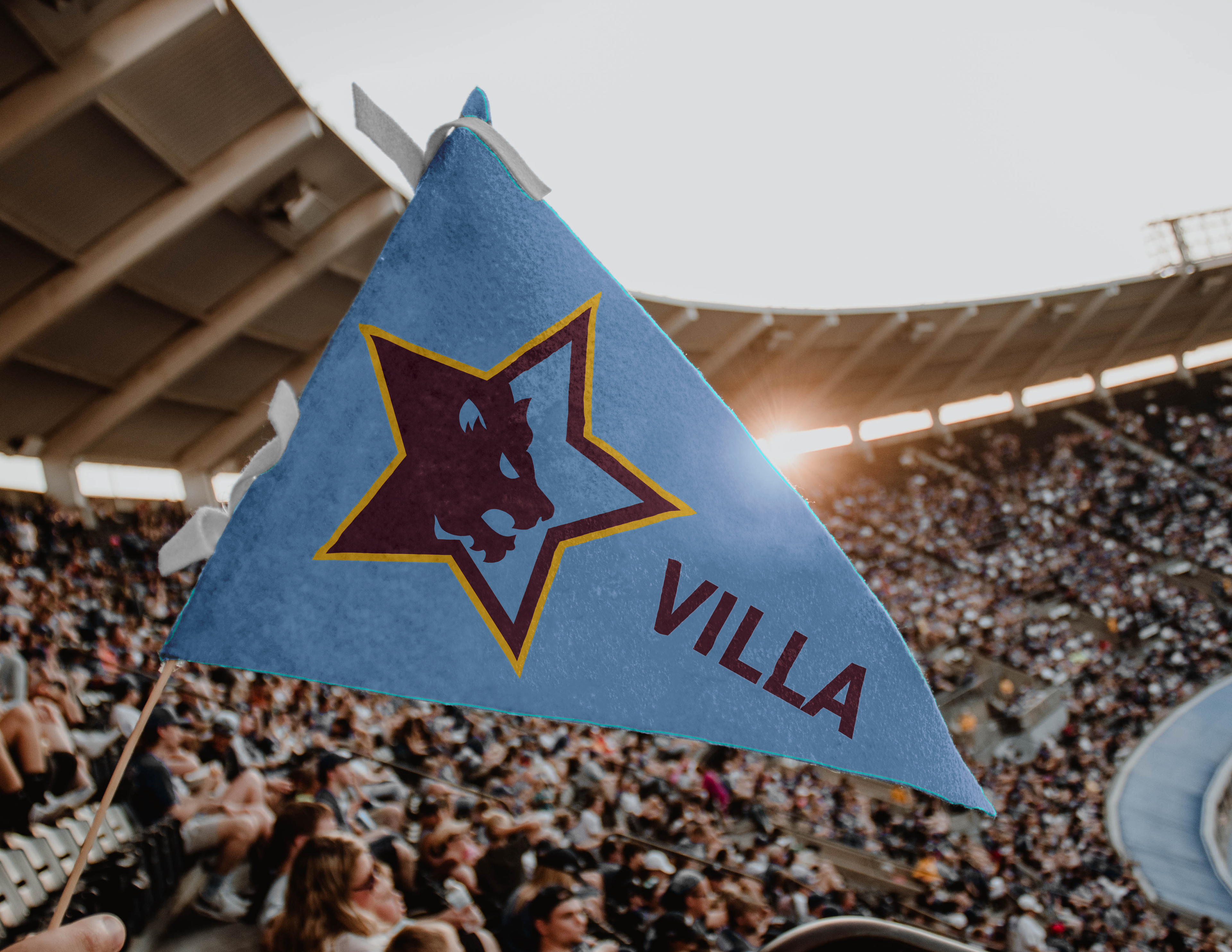
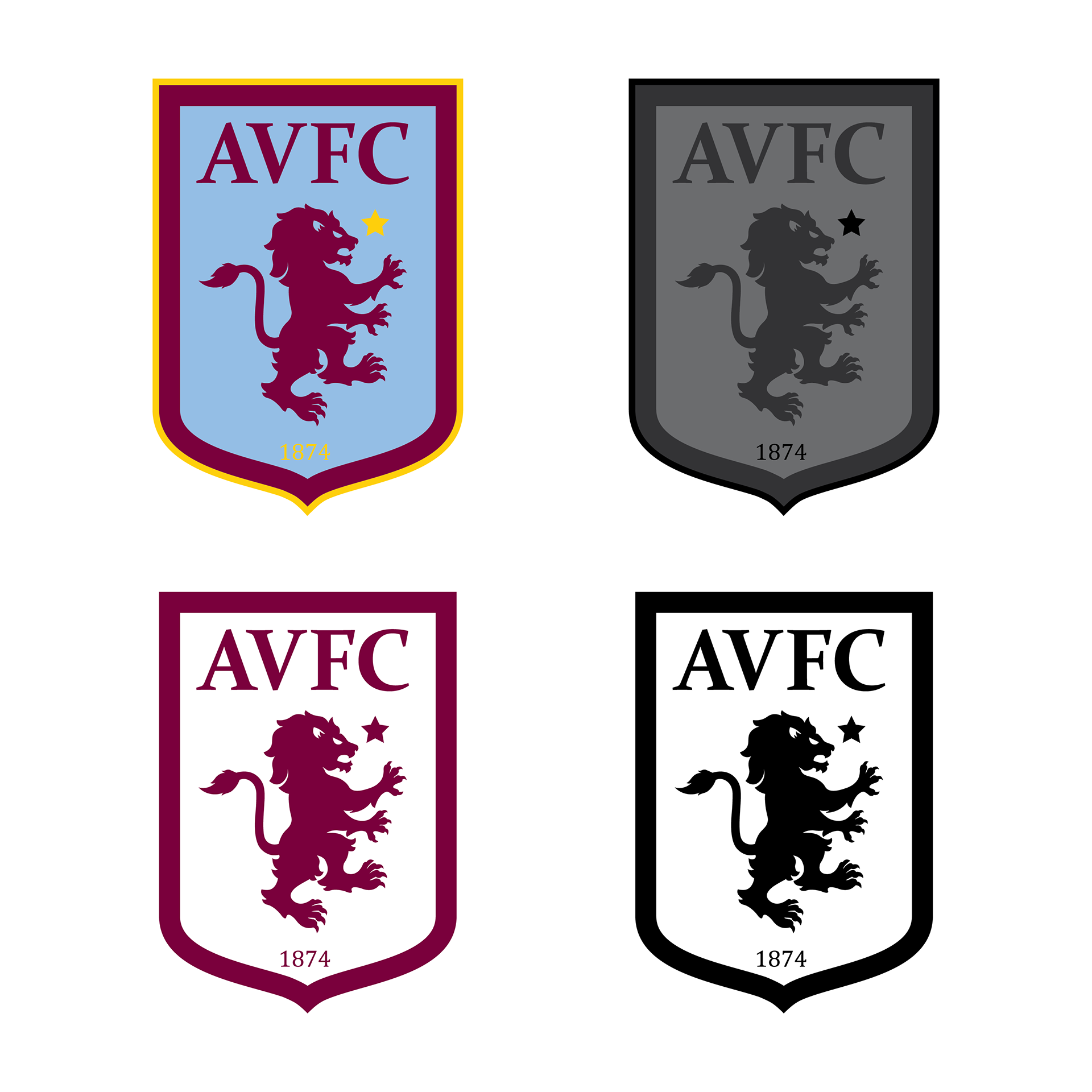
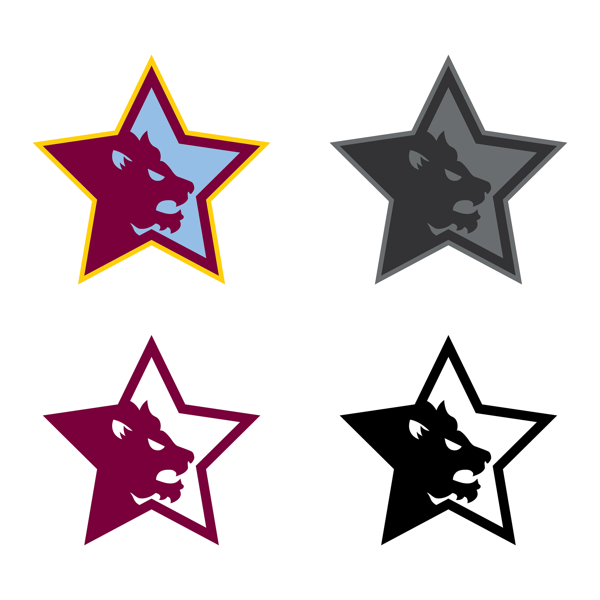
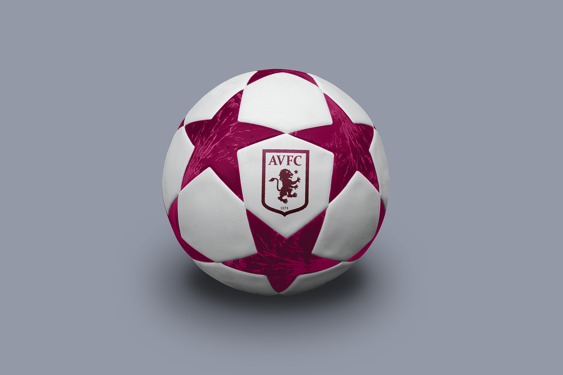
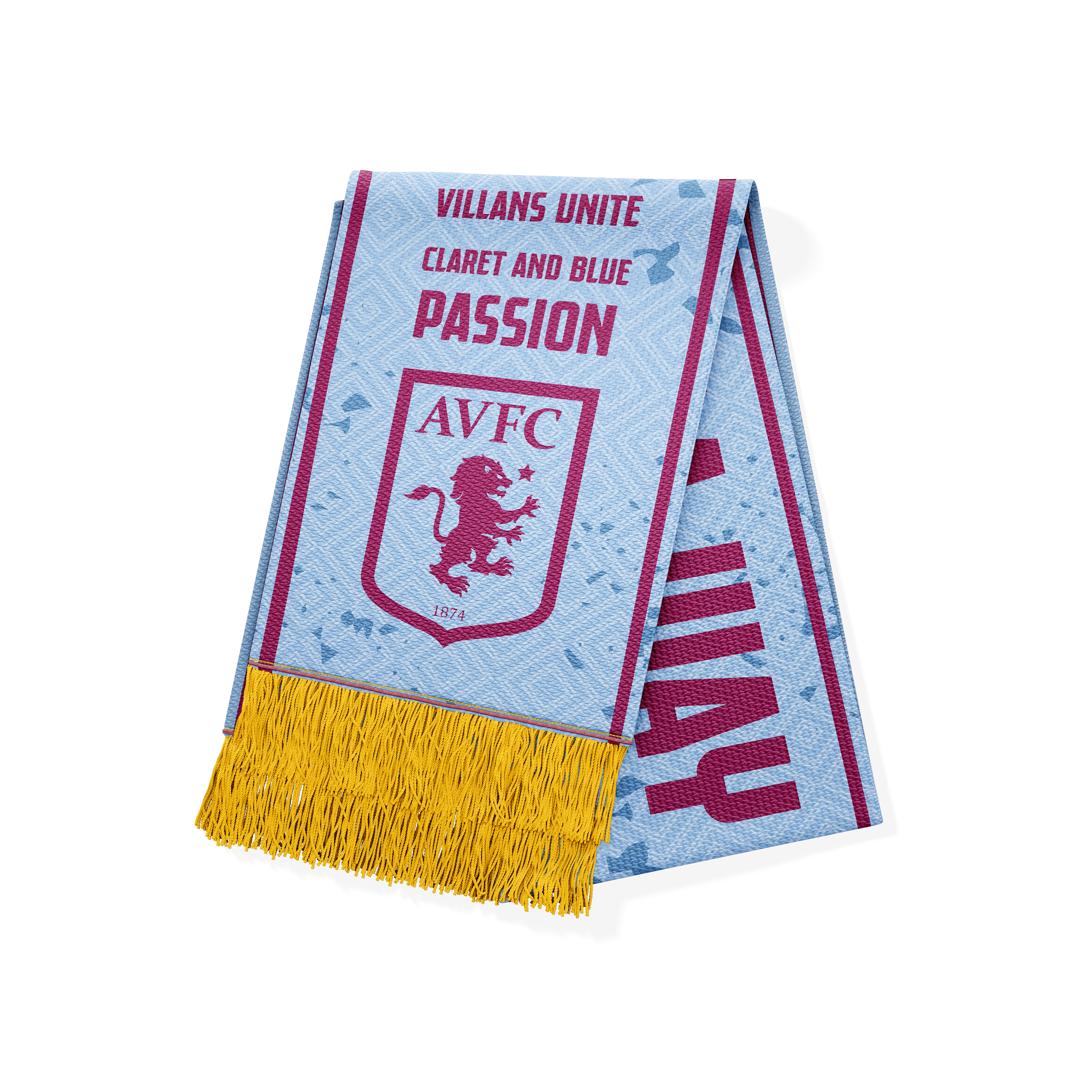
I decided to create a new logo that was inspired by the previous shield logos, while still making it different and modern by itself. I designed a new lion symbol and tweaked the shield for a better balance of colors. Now this logo features two borders, a thicker claret one, and a smaller gold one. Additionally, I also was inspired by the star on their crest, which pays homage to their European Cup win, to make a special logo that can be used for their European matches. While designing these logos I am taking into account the logos and branding of other teams in England. With the new round design that Aston Villa tried, a lot of other fans called it a rip-off of the Chelsea logo, which is also round and features a lion. While Aston Villa has a history of using a round crest before they went on to use the shield, to the younger generation the shield is what they associate with Villa and I wanted to have a new take on the classic shield design that can stand on its own as a unique crest.
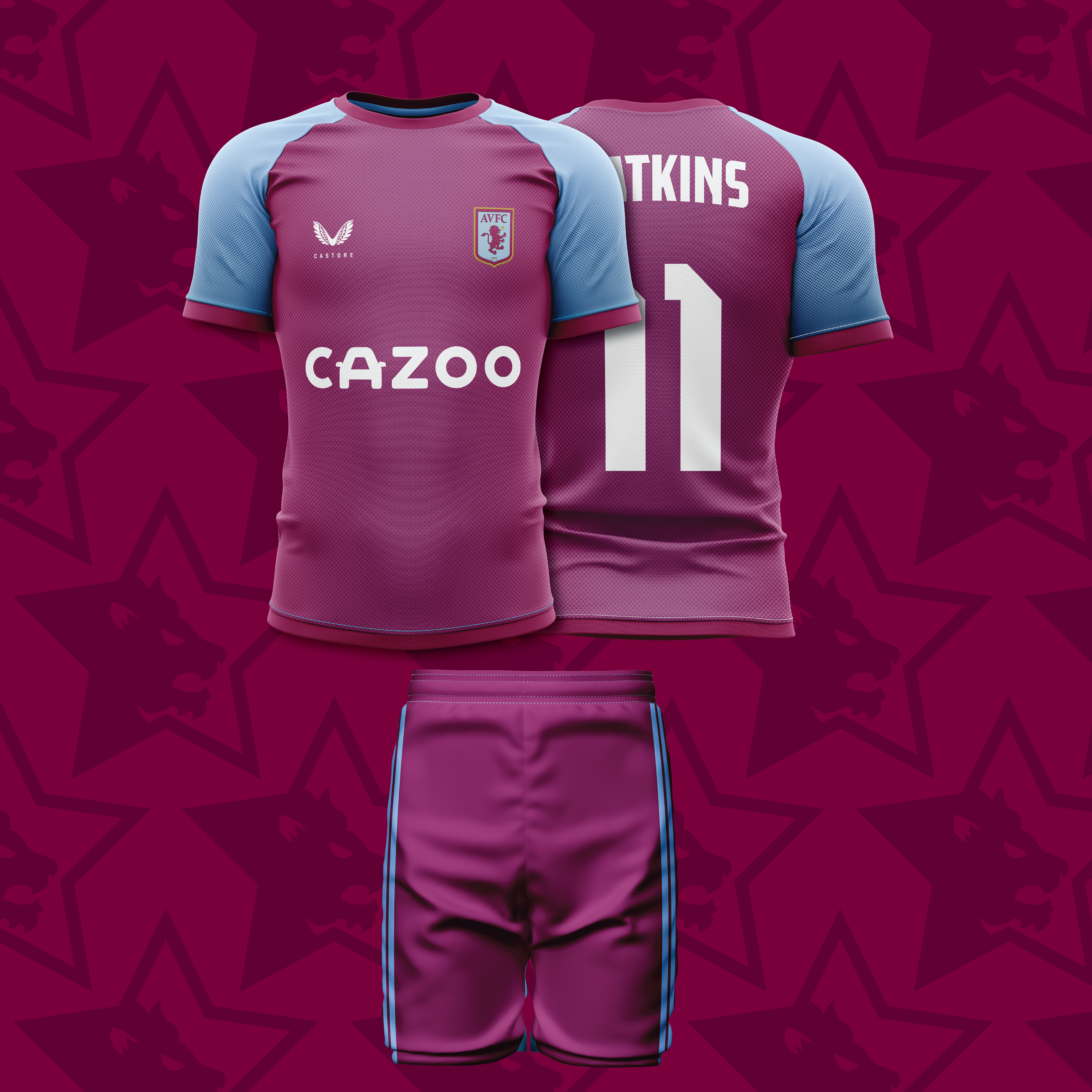
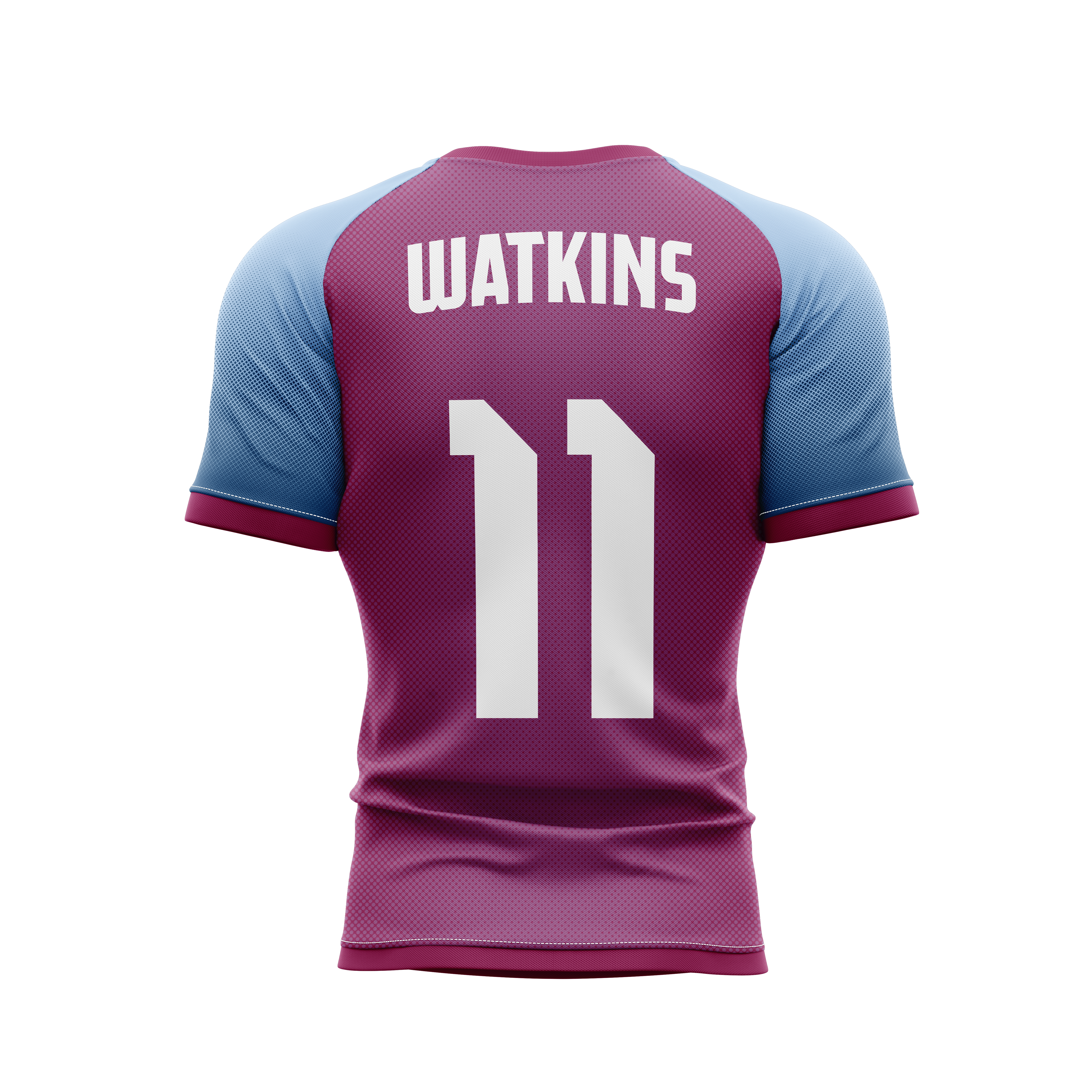
Home Kit
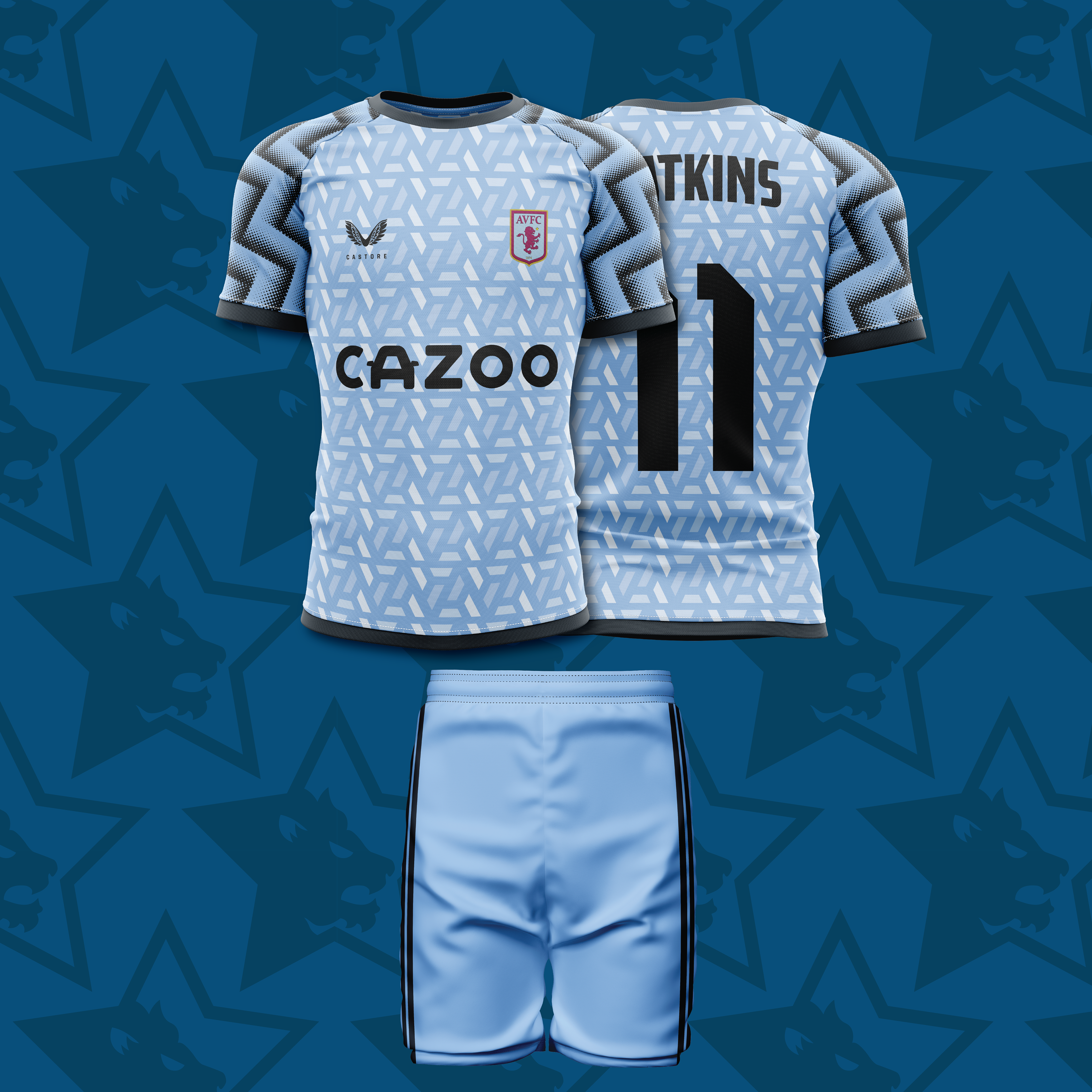
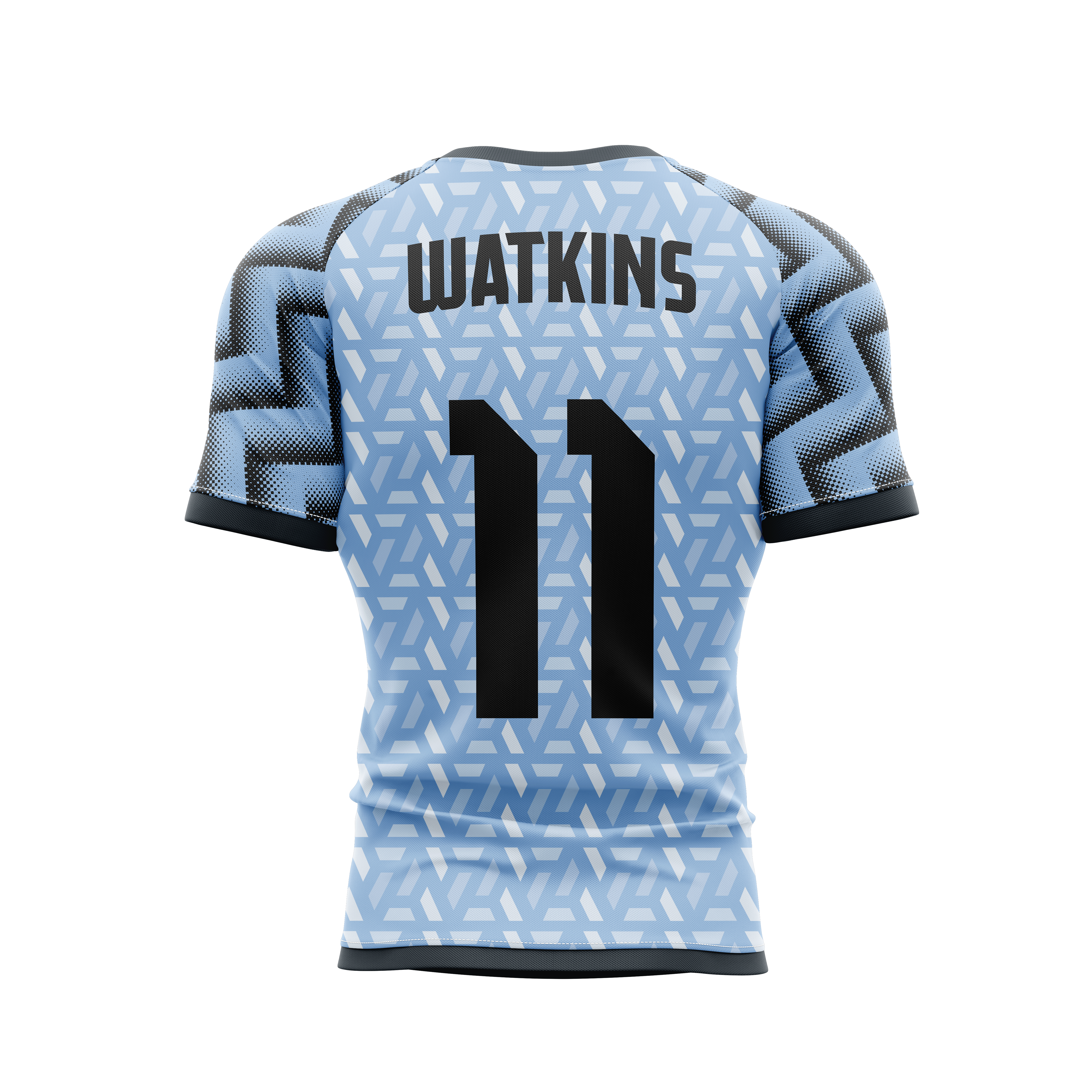
Away Kit
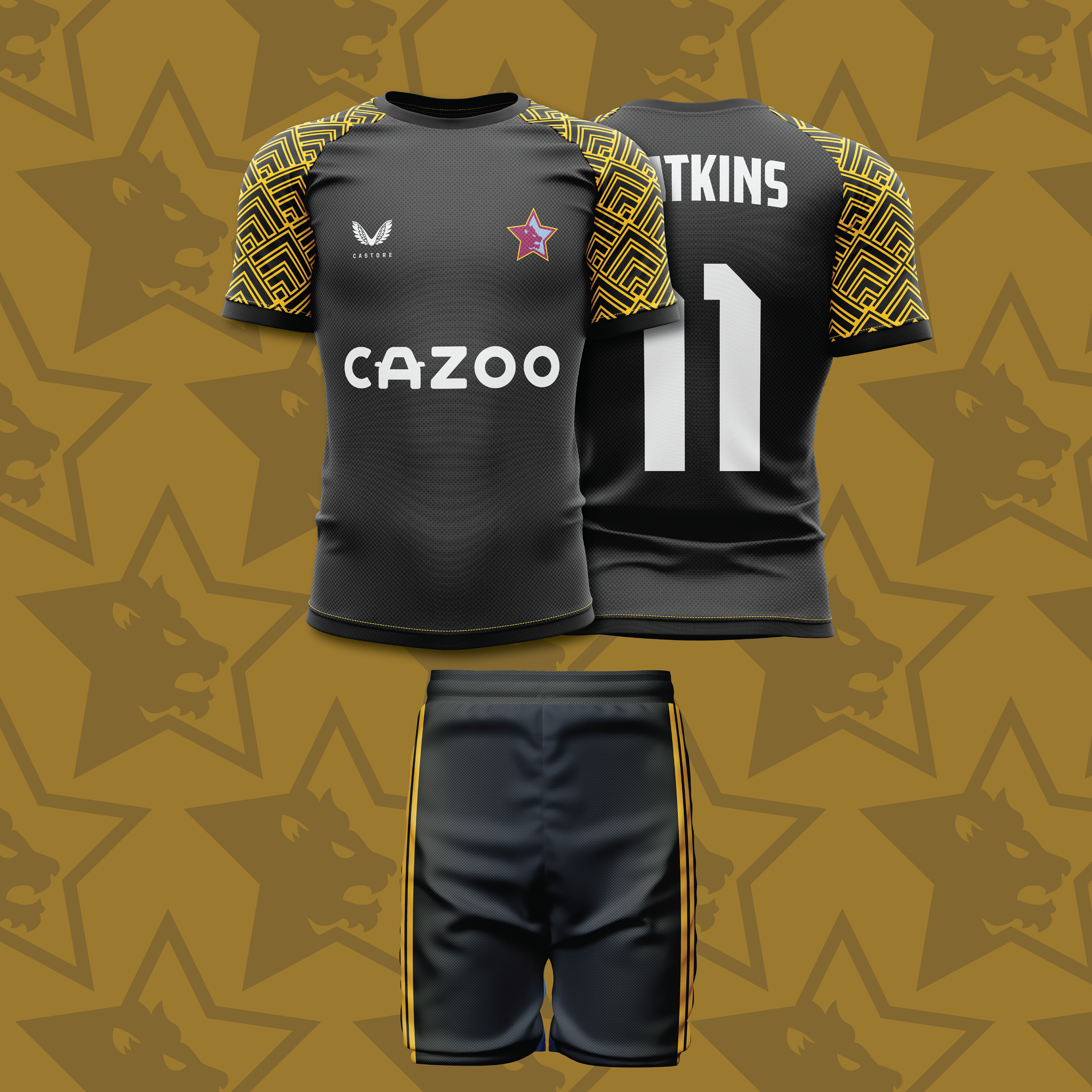
Third / Special Kit
